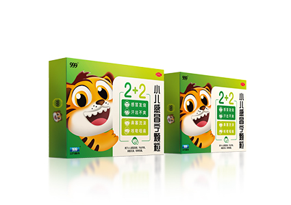
The baby meal that starts with a smile
The Brief:
Baobaochanle, a baby food brand, does not carry a consistent packaging identity and image throughtout its product range. We were tasted to help revamp the brand's packaging to deliver an outstanding visual language that is effective, appealing and communicates a consistent brand and product messaging.
Our Strategy:
After conducting a market analysis and brand audit, we realized that the brand had unique and compelling product information that was not being communicated to customers. The brand's baby food products are made from fresh, natural ingredients, with zero preservatives/additives. The baby food is also prepared using an original recipe that delivers a natural taste and flavor. This information did not appear on existing packaging and we saw this as a lost opportunity to communicate the product's key selling points to consumers. Results of the survey showed that Baobaochanle uses only wholesome and natural ingredients would give mothers peace-of-mind, allowing them to choose the brand for their babies confidently.
Design Solution:
Our design was inspired by Baobaochanle's existing brand logo. The objective was to create a unique visual language that communicates a compelling brand story. To appeal to mothers, we incorporated elements that they considered to be important, namely the brand's use of fresh and natural ingredients. This is communicated in a fun and friendly, yet modern design that uplifts the overall brand image in a way that is consistent across the entire product range. This has garnered positive comments from our target and helped revitalize the brand's standing amongst competitors. What started as a packaging revamp has resulted in a refreshed brand image, making way for future opportunities in merchandising.